

Your homepage has one job: make your ideal client feel like they’ve found exactly what they’ve been looking for. If it’s not, your copy is most likely the culprit…not the design.
Put yourself in their brain…
Most of the time homepage copy isn’t bad, it’s just incomplete. It probably talks about what you do, but not why it matters. It lists your services, but doesn’t speak to the person reading it and leaves your hard earned visitor guessing about what to do next. Try looking at your home page with this perspective, through their eyes.
Here are the 5 most common things your home page may be missing (and how to fix them).
1. A clear answer to “Is this for me?”
Within seconds of landing on your homepage, a visitor should know if they’re in the right place. If your headline is too broad or too clever, it creates confusion. Confused people leave.
Your copy should make them feel seen. Think about the problem they’re trying to solve or the outcome they want.
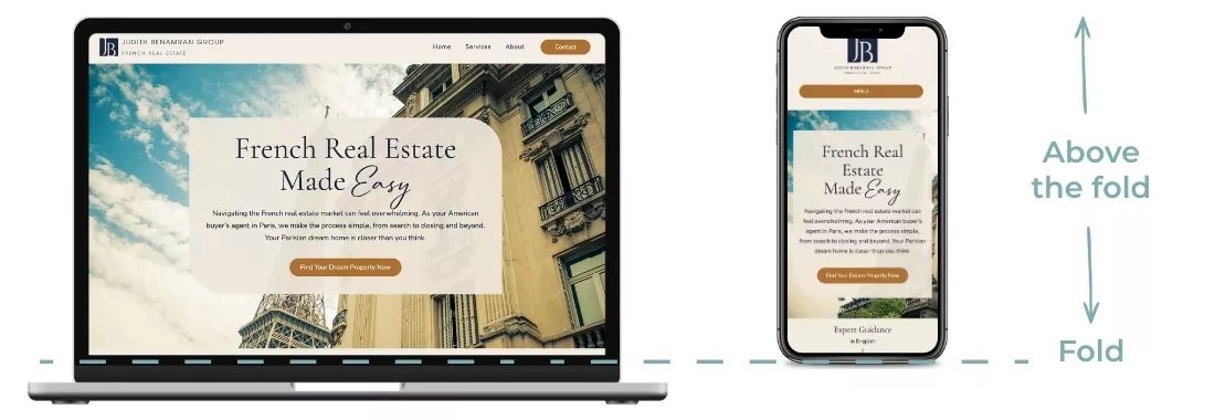
Instead of: “We provide solutions.” Try: “Helping expats buy their dream property in France.”
2. Showing the value that goes beyond what you do.
Most homepages say what the business offers. Fewer say why it matters or what’s different about working with you. Your value proposition isn’t just your service list, it’s the result your client gets and the experience they have during the service journey.
Ask yourself: what does my client’s life or business look like after working with me? Talk about that transformation. Above the fold, this could be a sub-heading.
Sub-head could be: “Get experienced, step-by-step guidance and assistance you can trust.”
“Above the fold” is the portion of the webpage that is seen right away, before the user/visitor needs to scroll. Visitors spend 80% of their time in this important section of your website, so this piece of real estate is crucial.
3. A Clear, obvious next step.
Every homepage needs a clear call to action. Don’t make someone try and figure out how things will work or what they need to do next.
Pick the most important action you want them to take. Is it to book a call, fill out an inquiry form, grab your freebie? Make that impossible to miss. Don’t make them hunt for next steps.
Have a button in your header/hero section above the fold. Make an obvious CTA (call to action) button in your nav menu.
TIP: Include an easy 3-step plan further down on your page so they know what to expect:
Example: Step 1: Book a call, Step 2: Choose a plan, Step 3: Enjoy your ____!
4. Social proof to position you as the expert.
Testimonials and reviews are trust signals. A lot of homepages bury them at the bottom or don’t include them at all! Your potential client is sizing you up the moment they land on your site. Give them a reason to keep reading, let them envision how you can help them too.
Have a short, clear quote near the top to mid area of your homepage. An easy to scan/read, one or two lines from a happy client can make the difference.
5. Copy written for your potential client, not about you.
This is the big one. It’s easy to write a homepage that’s all about you…your story, your process, your credentials, but your visitor landed on your page because they have a need. They want to know if you can help them. Call out the pain points they are experiencing and remember, they are the hero of the story, your site should show how their problems will be solved, not a brag sheet about you.
3 More Homepage Tips
- Keep your navigation menu uncluttered. Not every page needs to be in your nav menu for Pete’s sake! (Said with kindness and love.) Remember item #3 above? Keep things easy to find and only add the most important pages to your navigation such as Home, Services, About and Contact (other pages can be in your footer in needed). Your web developer will help you strategize this.
- The majority of people that land on your site are going to scan, not read every word in detail, so make sure your headlines are a clear, brief description.
- Don’t forget function. Ensure your pages and images load quickly.
Are you a checklist kinda gal? Here’s a quickie DIY Homepage Copy Audit
Pull up your homepage and check these off:
- Can someone tell within 5 seconds who you help and what you do? If not, your headline needs work.
- Does your copy speak to your reader’s problem or goal? Or does it mostly talk about you?
- Is there at least one testimonial or trust signal visible early on? Don’t make people scroll to the bottom to find proof.
- Is there one clear call to action? Make it obvious.
- Does your copy reflect your current offer and ideal client? Or is it a little behind where your business actually is?
If you said “not really” to more than one of these, your copy is worth revisiting — it’s one of the things you can update on your site to deliver the highest-impact.
Need a second set of eyes on your website?
Sometimes we’re too close to see what’s missing. (Can’t see the forest for the trees kind of thing.) If you need another set of eyes or are wondering if it’s time for a strategic re-do, I’d love to have a chat so we can get your website working harder for your business.
If you found this helpful, grab the Conversion checklist below for more great tips!
À bientôt !
Janet

EVALUATE YOUR WEBSITE CONVERSION POWER
Website Audit Checklist: 4 Essential Elements For A Website That Converts
Use with this simple, but comprehensive checklist to help you identify where improvements are needed and help your site work to its full potential!

Hi, I'm Janet
Web designer, developer, and digital strategist for growing businesses. Learn more about how I can help you keep moving forward with a transformative, conversion-focused website that works wonders for your business and helps you go from stuck to strategic.